Monday, April 4, 2016

Favorite Logos


Image result for uniqlo
1. One brand that I really like is "UNIQLO" because the design itself looks really simple and that it is very recognizable because its a text only. The letters also look like Japanese letters if you look at it unconsciously, so it shows that the company was originated from Japan.

2.     


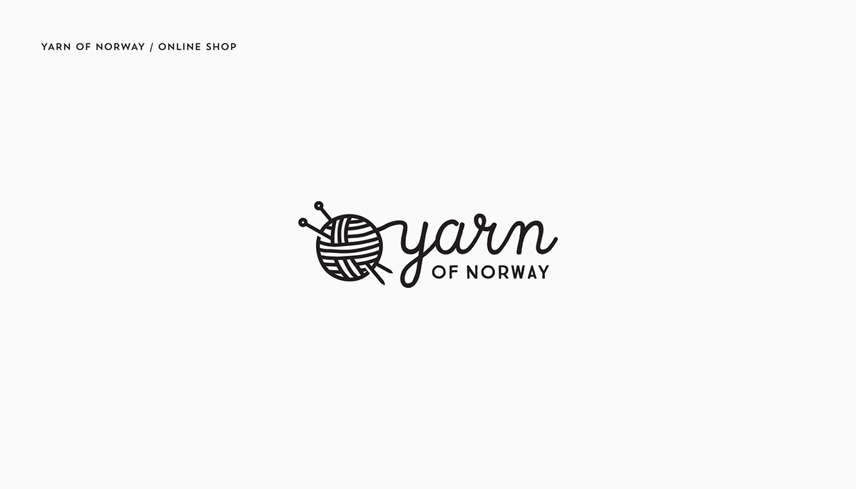
I really like this image because the image clearly shows that it sells yarn products, and it has a image that represents yarn in order to help communicate with other peoples with different languages.


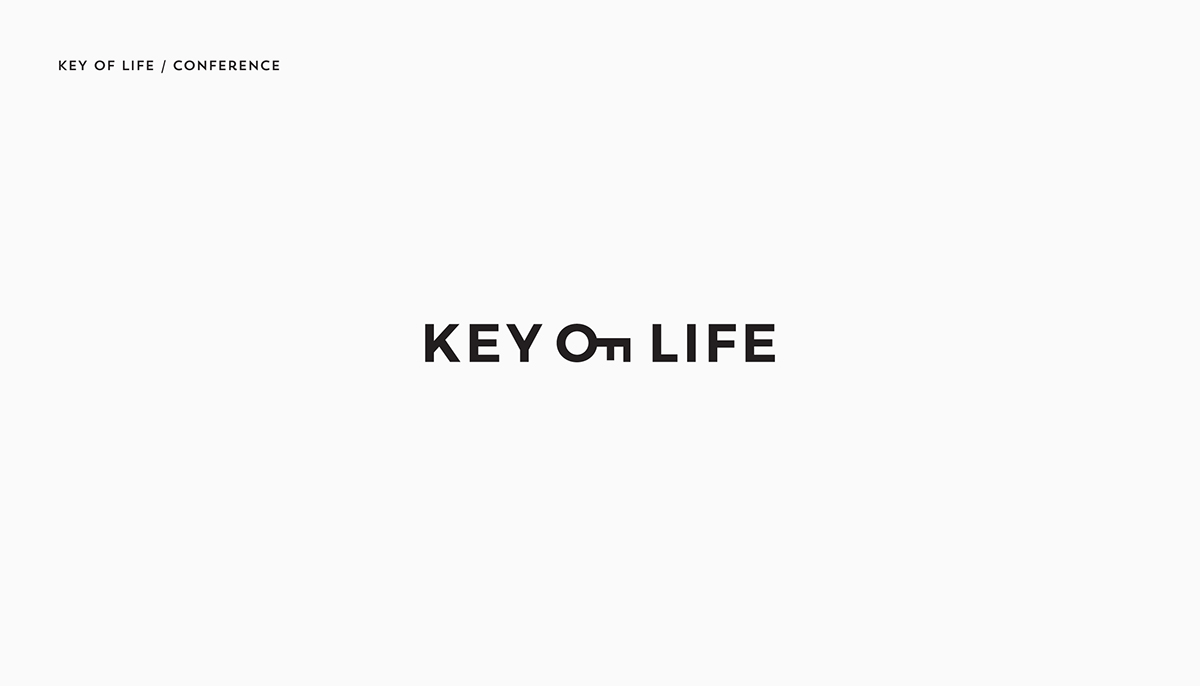
I like the style in which the word "of" was phrased. The "of" itself is changed into a key which looks very creative to me. The "of" is sort of like the center of the image that reveals "of" as portraying two different ideas or words.


The image of "social swap" shows the letter S that represents the beginning letter of it. While on the other hand, the S also emphasizes a swap between two things or between two people.


The E is represented by the paw, which really emphasizes the word tiger and that it creates a meaning by using the word E abstractly and it is used to help communicate with different languages that the paw, represented by the E, to shows that it has something to do with animals.


I like how the image is connected with a picture, the word volt is portrayed with a lightning sign or a electricity sign to show that the motionvolt games are very energetic because of the lightning.


Monday, March 21, 2016

Stance Blog Reflection

My Final Design

My First Design


1. I believe that my poster is quite clear because it is quite simple and the font shows which position I support (Do not vote for Donald Trump). My composition is the color of the Mexican flag with a wall to show that all Trump wants is deportation and segregation, which will make America not diverse.

2. In my first version, the composition was quite bad and everything was all over the place. Not only that I focused on way too much topics rather than just one important topic that stands out for Trump. However, for my final design I do feel quite accomplished because I made my composition much more simple rather than being all over the place. I was able to communicate clearly on one important topic than focusing on multiple topics.

3. In my first version it was just random colors with a graph to show that the economy is going to be bad if Trump was president. But on my final poster, I sort of changed the background to the theme of Mexican deportation and segregation. It makes it much more understandable that my first version.

4. Based on the rubric I think my concept is the strongest part. This is because the poster clearly shows which person I am focusing on and the background of the poster reveals which topic or issue Trump is causing if he was the president. So overall, my concept clearly reveals my stance on this issue. Moreover I am trying to convince others using this concept to influence people to not vote for Trump.

5. At first I thought I know my topic clearly, but as I started the project, I realized that I had no idea what composition I should do. I just plugged in some random background to make it look interesting and I added some words to show the conflict. But later I realized that my conflict was very blurry and very weak because it does not really show the main idea and what I was actually going against. But as the project progresses I got help and I finally understand that I had to focus on a single important concept rather than supporting multiple ideas at the same time.

6. Some technical issues that I had was forgetting the images that I used for illustrator. I would forget to save the images so it would be blank and I would get frustrated because I have to find the image all over again. Moreover, I had problems creating another blank page on the same file because I was very unfamiliar with illustrator.


Tuesday, January 12, 2016

My stance

       
           Through social media nowadays I see a lot of current events and up to date trends that had been going around. I have seen a lot of post about Donald Trump and how he had been a horrible person that discriminates against the Mexicans. There were always posts that I have agreed and disagreed with. For example, there are videos or vines that shows how a person acts under a certain circumstance really reflects the personality that everyone has. I strongly agree to posts that connects to me in some ways and I disagree with posts that sounds silly and unrealistic. I have seen posts such as the conflict in the Middle East and that many are suffering from terrorism in the Middle East. Right now I am concerned with how America might be able to end the conflict against other terrorist groups in the eastern part of the world. Also I am concerned with who might be our next president, and how he or she might have a big impact on our society.

Topics
- Syrian Crisis
- Presidential campaign

Links
http://www.nytimes.com/interactive/2016/us/elections/2016-presidential-candidates.html

Syrian Crisis

Wednesday, December 23, 2015

Jia Yuan Li Self Symbol GIF


1. My self symbol concept is me waking up every morning even though I do not want to. I arrived at this idea because that is what I do most of my school days. Even though I want to sleep more, the alarm clock always wake me and at like 6 AM to tell me to go to school. This image relates to my concept because in the middle of my sleep, the clock wakes me up and I sat up dazed and not know whether I want to go to school or just fall back asleep.

3. At first, when I drafted my idea on the post its, it was more simple with very little details. But through photoshop, I added more background and details to enhance my room and a window to show that the moon is still out (early) but I still have to wake up for school.


Tuesday, November 24, 2015

Transformation Project Reflection

Transformation of my original photo.


1. For my concept behind the portrait transformation, I wanted a picture of a forest and a picture of me as a focus to show the concept of nature. By adding a photo of myself and a picture of a rainforest in the background, it shows that I admire nature and that it is an important theme to me.

3. If there was one word to describe my project, I would say it is "ok" but bad at the same time because it is the first time I made changes and combined two photos to create one single image by blending both original image into one transformation picture. I feel kind of accomplished by what I have done, however, I think I could have done more work and made my transformation image look better instead of a image that looks pretty sloppy and simple.

5. Step by Step instruction on a Photoshop process (Layer Mask).
1) I clicked on a layer
2) I then clicked on the camera looking thing on the bottom right corner
3) On the layer mask I use the color black on the brush tool (black) to color the background of the current layer to include the background from a different layer.
4) I used the eraser to make some edits because the eraser reveals the images of the current layer. I erased any overlaps that my background has on my original image so they look blended in together.